
Designing Collaborative API Documentation Tool
Building a collaborative platform for creating, reviewing, and publishing API documentation, designed for how teams actually work.
Background
Helping people write better technical documentation with a collaborative approach.
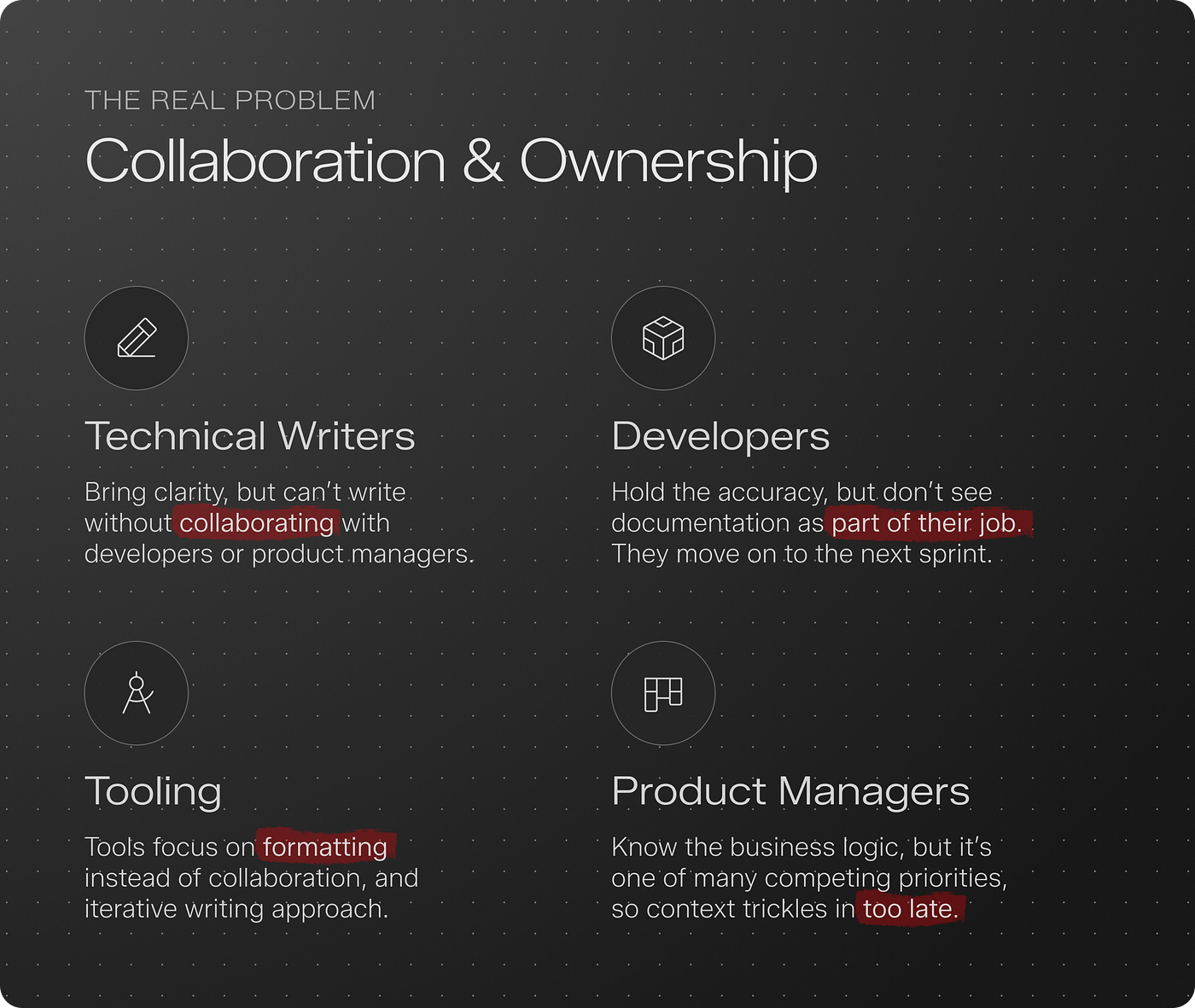
Based on our interactions with technical writers, developers, and members of our own team, we figured out that documentation isn’t broken because of tools. It’s broken because no one owns it.
We understood the gaps and found a few ways to bridge them.
My Role
Product Designer
Team
1 Designer, 3 Engineers, 1 Manager
Duration
2 Months (for MVP)
Research & Findings
As part of the research exercise, we contacted writers, developers, and managers. Some shared negative feedback about existing tools in the market, while others mentioned why they don’t document.
Job To Be Done
We used the Jobs To Be Done framework to understand what different users were trying to get done. Based on the problems we observed, we mapped needs across three personas; Developers, Writers, and Product Managers.
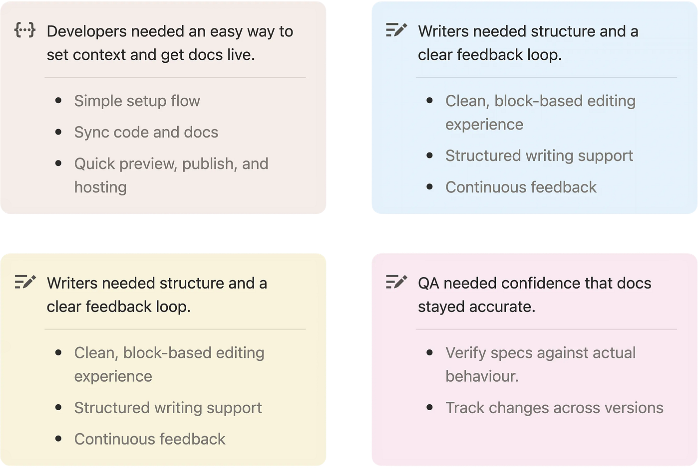
Hypothesis: Users need a way to write, review, and improve documentation continuously, instead of treating it as a one-time task.
A single, simple workflow can serve all roles better than multiple role-specific features, which often add confusion and bloat.
Early Validation & Course Corrections
We validated the prototype, but real usage exposed gaps that only appear when people actually try to do their job.
What Worked as Expected
System Was Right, Execution Needed Refinement
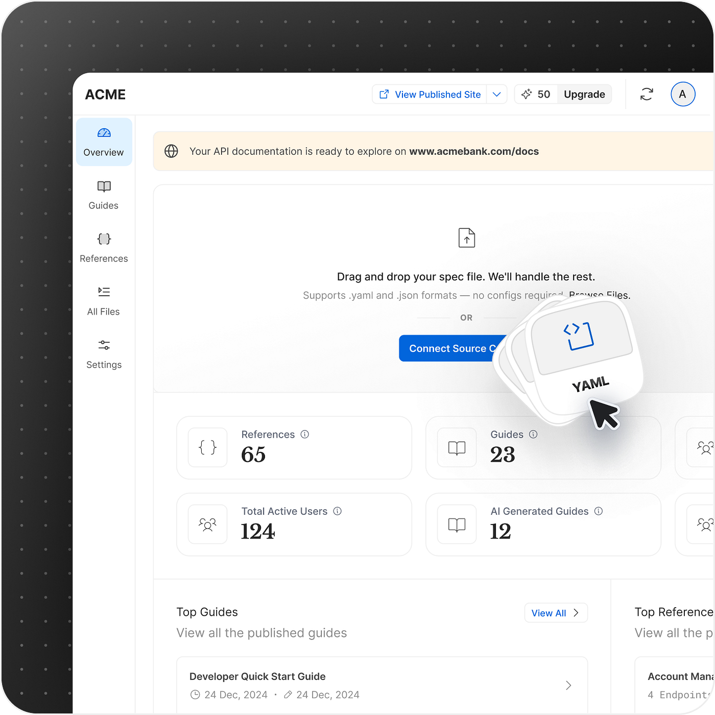
Easy way for developers to activate
Minimal step required to sync with source
Commenting facilitates feedback loop
What Needed Rethinking
People came with goals, not setup readiness
“I have signed up, now what do I do? I am overwhelmed”
“I don’t want a blank page to start with”
“I don’t have specs or guides but still want to explore tool”
“I have Google Docs, I just want to render that on your platform”
“I don’t want a documentation, I want onboarding docs for payments APIs”
A Pattern We Kept Seeing
Users weren’t stuck because they lacked intent. They were stuck because getting to that intent required too many steps upfront.
How Feedback Shaped the Product
Feedback from early users revealed where the experience broke down, helping us reshape flows to reduce friction and guide users toward meaningful outcomes.
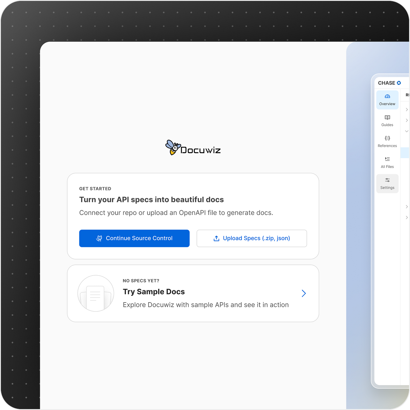
“I don’t have specs but still want to explore tool”
We welcomed users to try and play without even logging in.
“I have signed up, now what do I do?”
We shifted our thinking from “exposing features” to actively guiding users toward success.
“What you see, is what you get.”
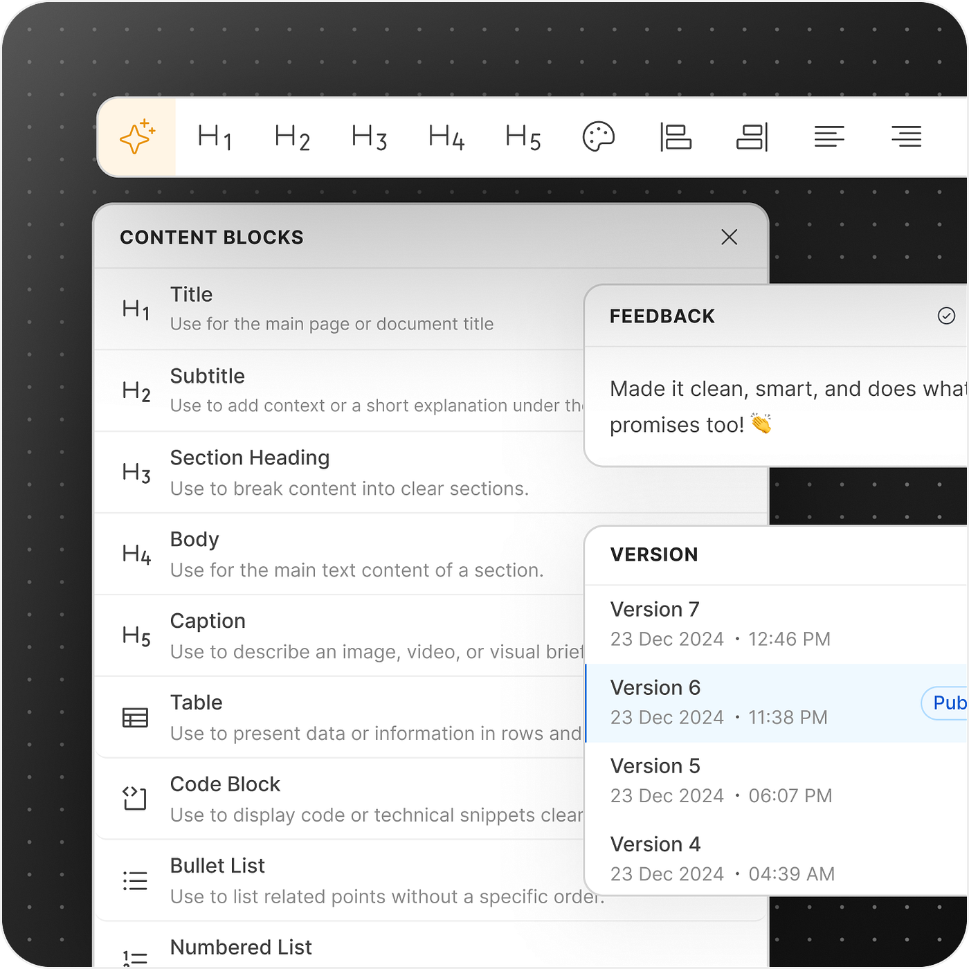
We enhanced rich text editing experience.
“I don’t want a blank page to start with”
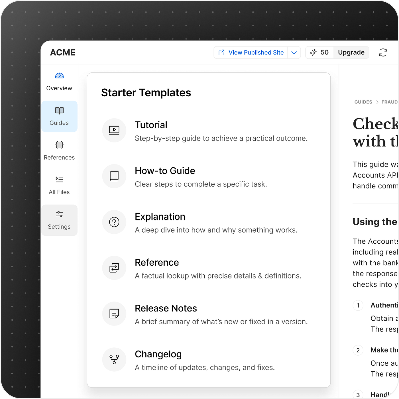
Templates give users a clear starting point, so they can focus on writing instead of structuring.
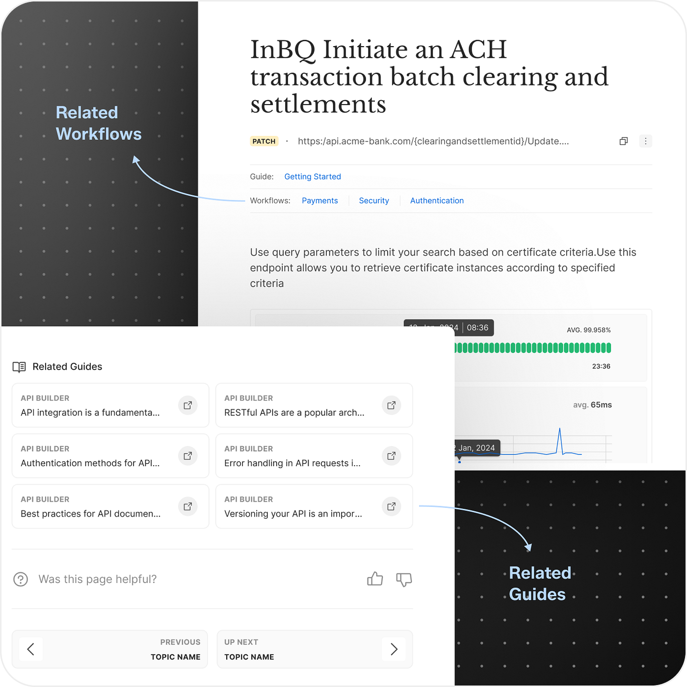
“I don’t want documents, I want specific use cases”
We reframed documentation as use-case-driven workflows, not isolated pages.
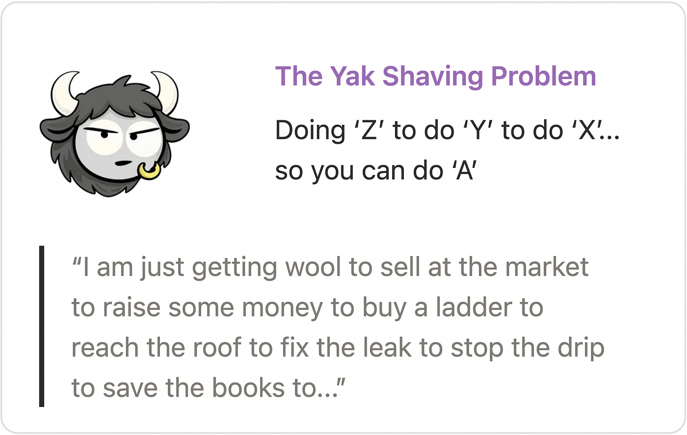
Solving The Yak Shaving Problem
Instead of stopping users early, we guide them when they actually try to do something.

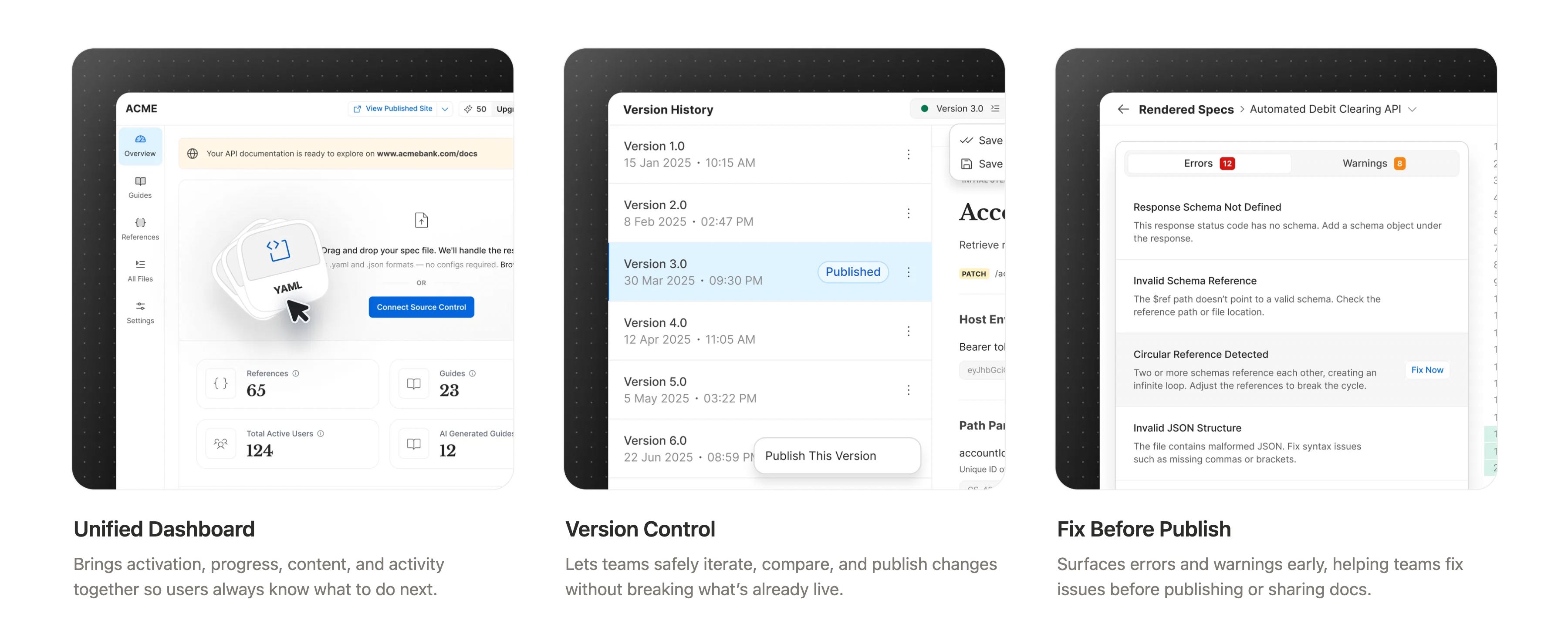
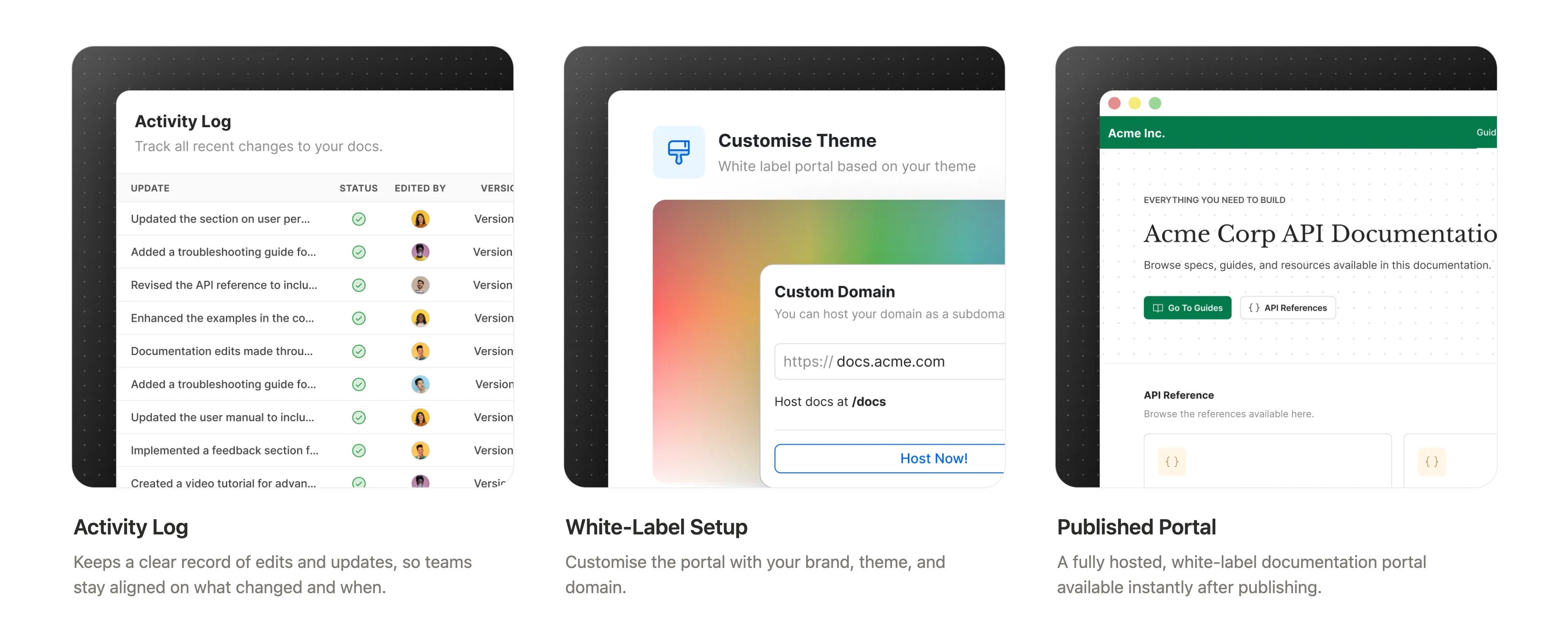
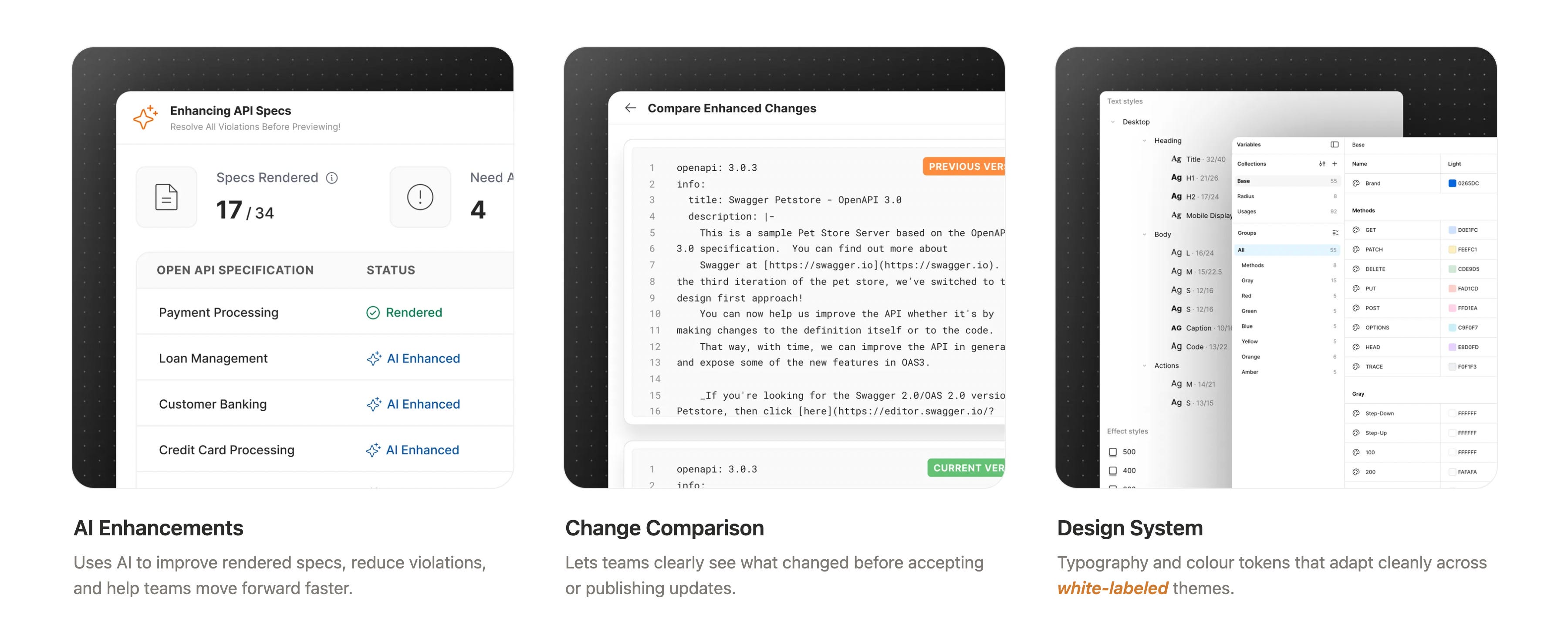
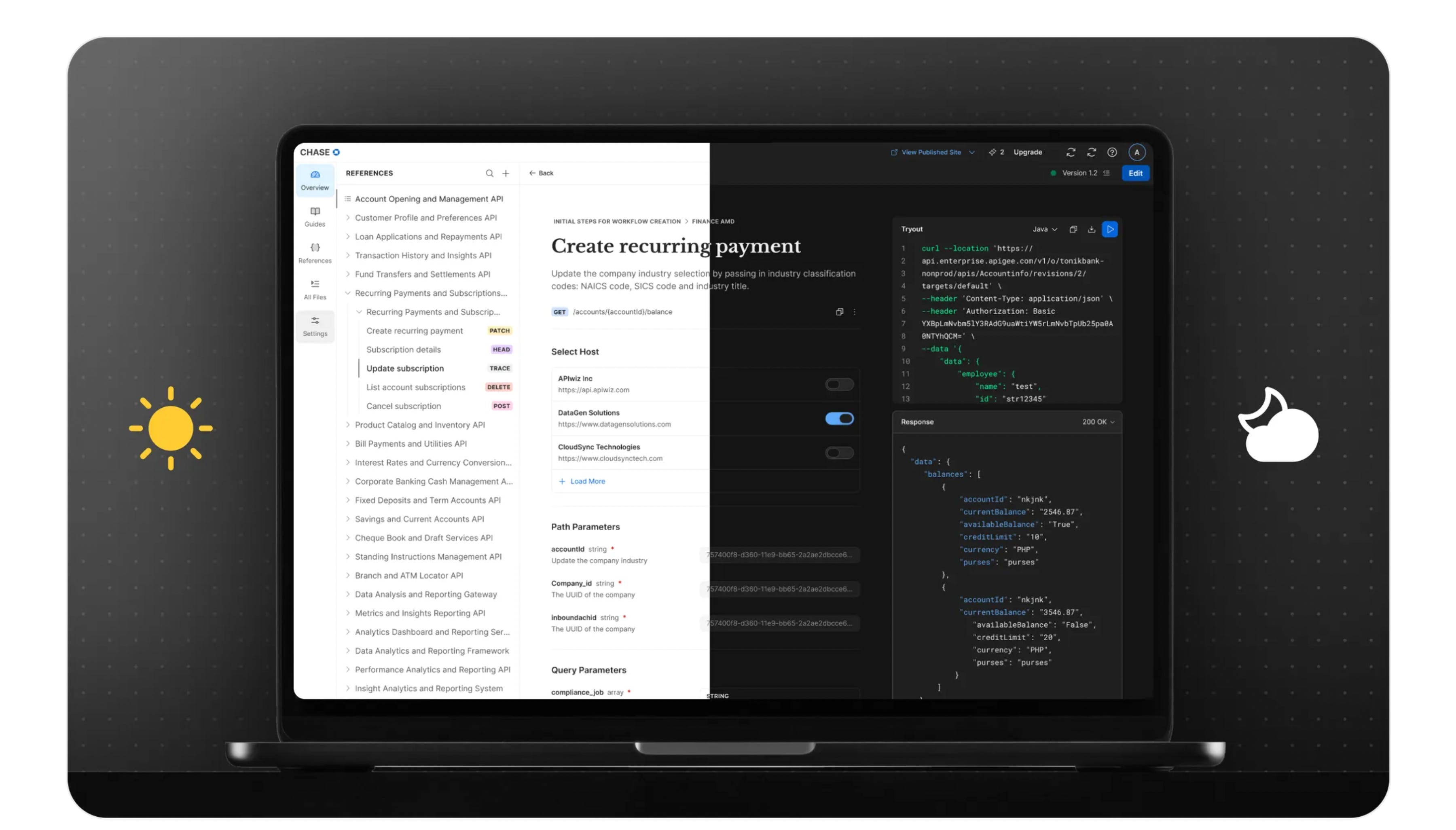
The Product in Action
A closer look at how key design decisions come together in the product through real screens and interactions.
Unified dashboard, version control, fix before publish
Activity log, white labeled, published portal
AI enhancements, change comparison, design system
Design Challenges
Building one platform for many personas meant every feature had to work for different needs and skill levels. The flows were tightly connected, and we couldn’t design in silos.
Our biggest risk was users hitting dead ends or feeling lost before reaching value.
Learnings
I learned how small details in UI can quietly make or break the overall experience. Being intentional with spacing, states, and interactions made a noticeable difference in how confident and smooth the product felt.
Working closely with partner teams reinforced the value of shared thinking. Aligning early and often helped us create a more cohesive experience, where the product felt consistent and intentional across touchpoints.
Impact
Reduced time to first value by letting users explore and preview docs without upfront setup or sign-up.
Improved activation by shifting guidance to moments of intent instead of blocking users early.
Increased collaboration efficiency through built-in versioning, comments, and activity tracking.
What’s Next
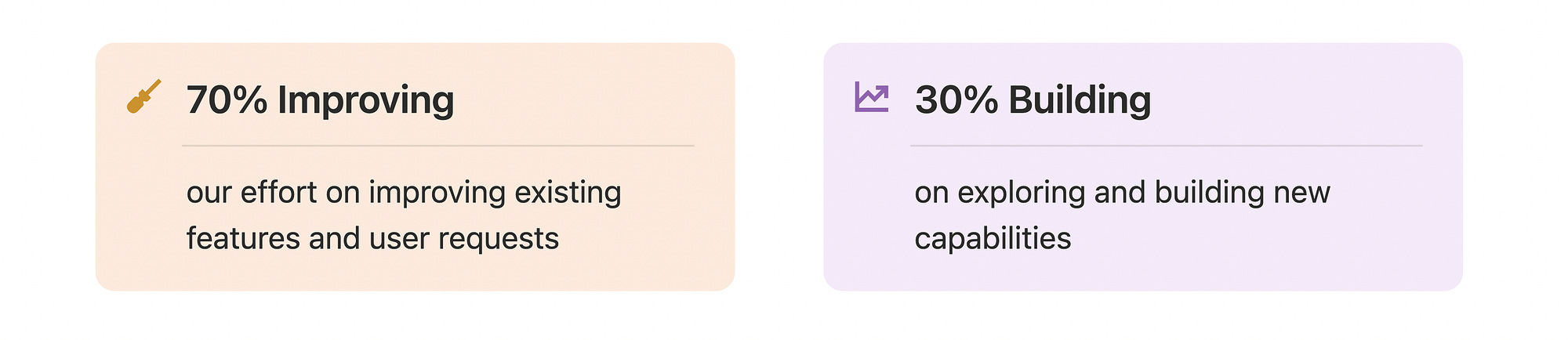
Now that the product is live, we’re actively collecting user feedback and pulling items from the backlog. With a strong foundation in place, the focus shifts to fine-tuning the experience, strengthening existing flows, and making the product more delightful.
Going forward, we’ll follow a 70–30 approach:
Curious to explore it yourself?